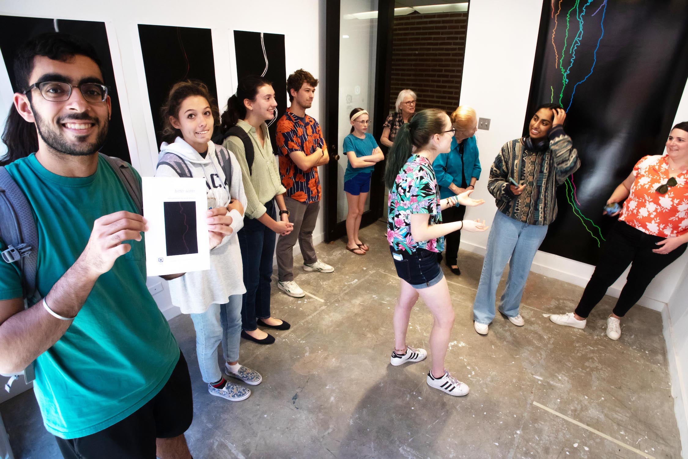
bitter water is a large-scale, data visualization exhibit that opened October 21 at 5 p.m. in the Sewall Courtyard Sleepy Cyborg exhibit space.
Five unique, digitally rendered graphic panels on display are derived using MATLAB from high-resolution digital topographic data collected via low-flying aircraft over Death Valley’s Amargosa River.
Sarah Preston (Jones ‘23), an EEPS major who studies Martian sedimentology under Dr. Kirsten Siebach, worked with Dr. Michael Lamb and Madison Douglas at the California Institute of Technology to analyze the Amargosa’s channel morphology. Sarah's effort would help Lamb and Douglas better understand the processes that enable river meandering in channels that are not only ephemeral, but located in arid environments.
Most meandering rivers are found on floodplains where vegetation provides much of the sediment cohesion that enables the development of meanders. Results of the study would not only shed light on why meanders occur without those controls, but also potentially explain the processes that operated on Earth prior to the evolution of plants, and beyond that to channels on arid planets such as Mars.
The idea for the exhibit originated in early June when Sarah posted a screenshot of erroneous MATLAB outputs in an Instagram story, which were seen by Sleepy Cyborg manager Ling DeBellis (Martel ‘23).
As with many aspects of modeling data for analysis, the output is subject to the logic and code written. Iteration is common, and sidesteps can sometimes generate erroneous yet spectacularly abstract visual results.
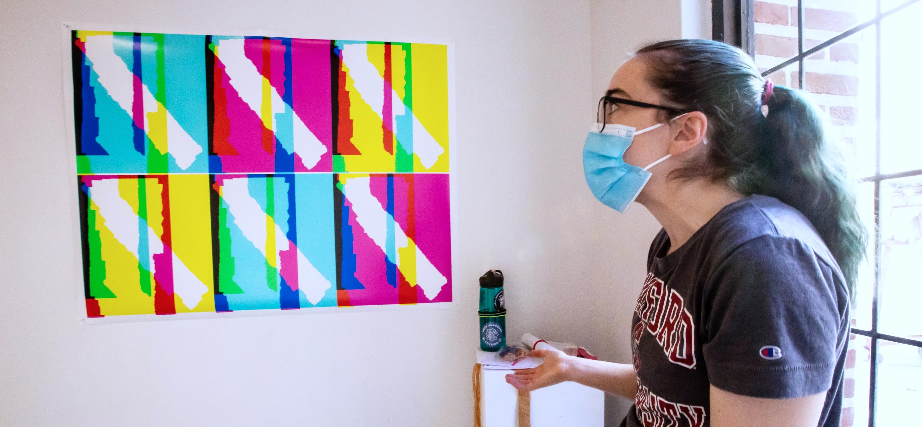
One such iteration (and the initial instagram post) resulted in the above Warhol-style six-panel graphic titled Concatenation Error, that is a composite of overlying topographic data sets, colored to represent elevation values for each polygon.
The original intent was for topographic data assembly to be concatenated to show the degree of change in elevation over the study area; instead, they were accidentally stacked on top of each other. The different colors in each panel result from changing the base color for each layer. Where elevation data from all three polygons overlap, the result is white.
“The data for the project are sourced from LIDAR (Laser Imaging, Detection, and Ranging) 0.5-m digital elevation model (DEM) derived from point cloud data with an average resolution of 19.50 points/m2.
With this data, I identified channels likely to flood during significant rain events, determined their slope and sinuosity, generated cross-sections, and calculated stress parameters to quantify the stress on the banks.” Preston said.
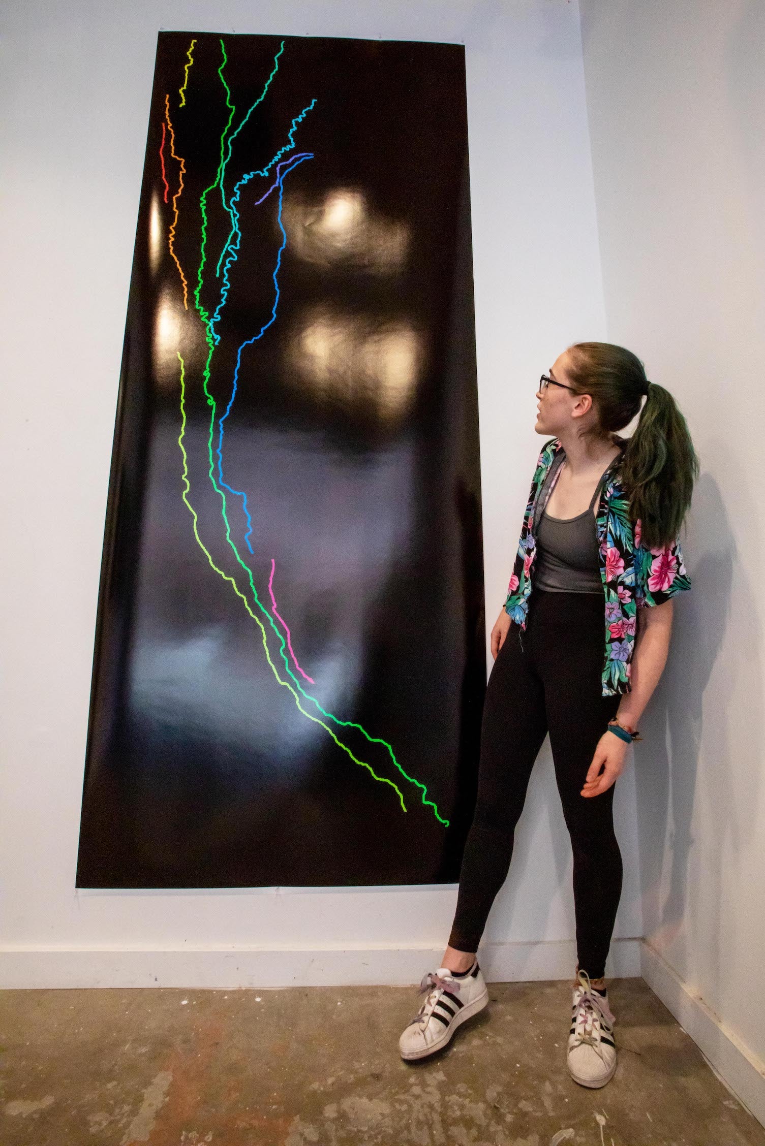
The largest panel in the exhibit, 10 Channels stands at nine feet in height, illustrating ten channels in the study area that would carry water during a flood.
The size of the panel conveys to the viewer the enormous scale of the data volume processed (1 pixel corresponds to .25 meter square).
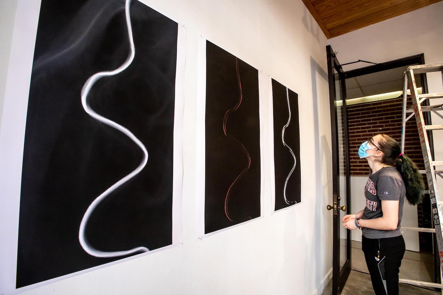
The panels that continue around the room reflect Sarah’s efforts to process and understand DEM data for the green (or longest) channel.
“My favorite is the Triptych,” says Preston. “Each panel uses a different approach to identify the channel location. The left panel uses elevation data, where highest values are black and lowest are white. The center panel shows the slope at each pixel; its deep red color suggests gently sloping banks that are difficult to algorithmically detect. The right panel is a binary (black vs. white threshold) mask derived from bank slope to delineate the channel based on bank location.”
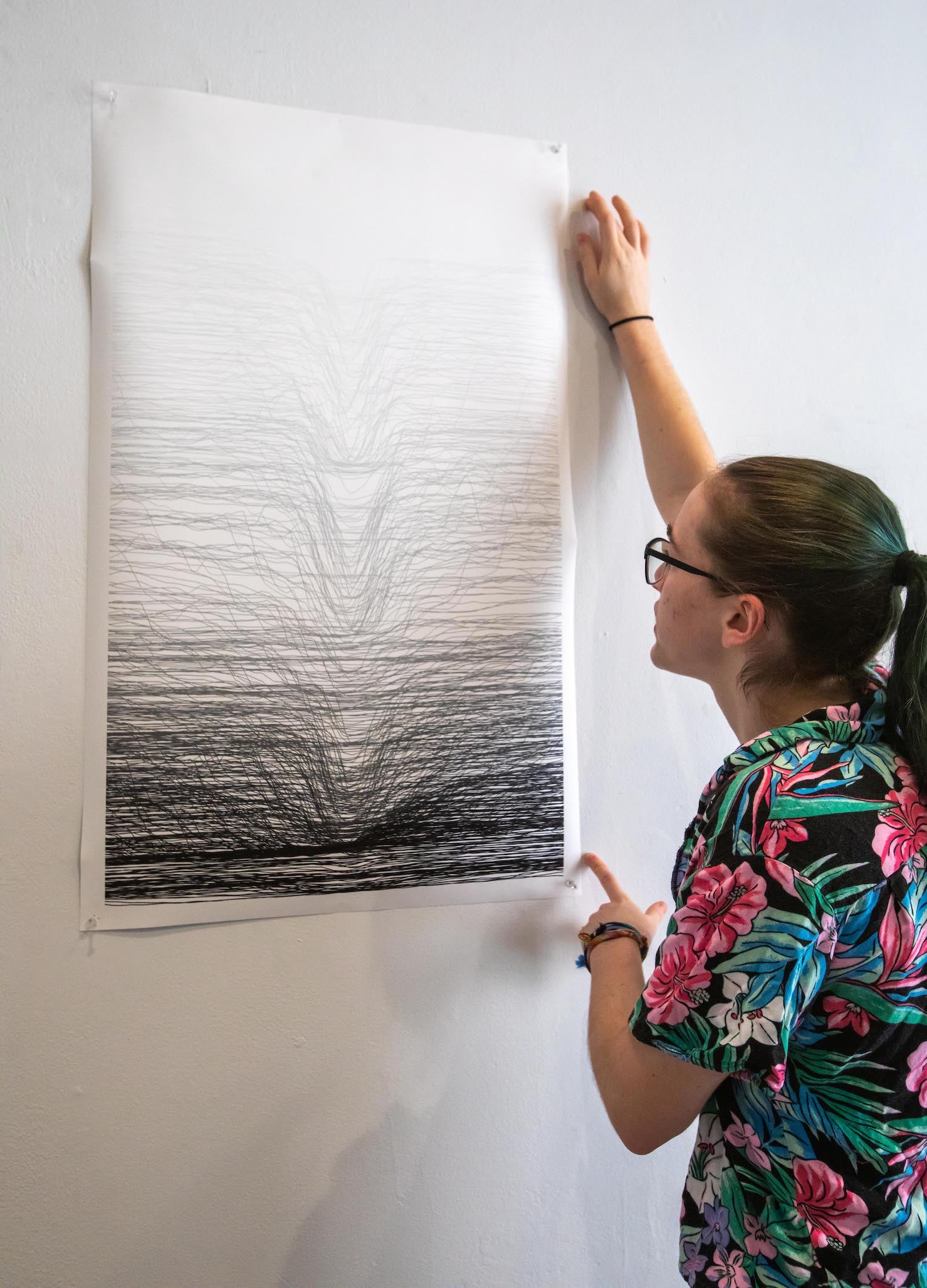
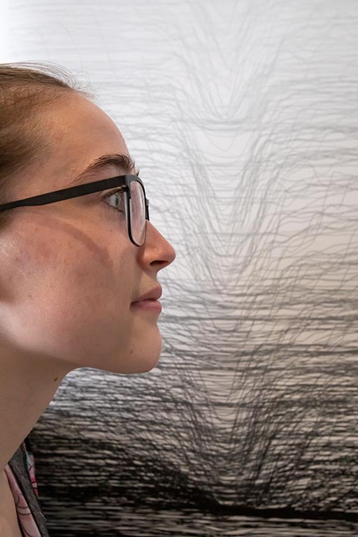
To advertise the exhibit Sleepy Cyborg manager Ling DeBellis chose the graphic with compiled channel cross-sections, called 593 Channels.
Sarah chose a graduated grayscale format to display the 593 channel profiles, calculated every 45 meters over the 31-kilometer channel centerline.
“Each unique line from the top to bottom of the graphic represents the channel morphology at evenly spaced centerline points along the channel path, centered to show how the channel profile varies over distance and elevation," says Preston.
In the case of the Amargosa, these elevation variations are subtle–as little as one meter in depth across a 30-meter channel.
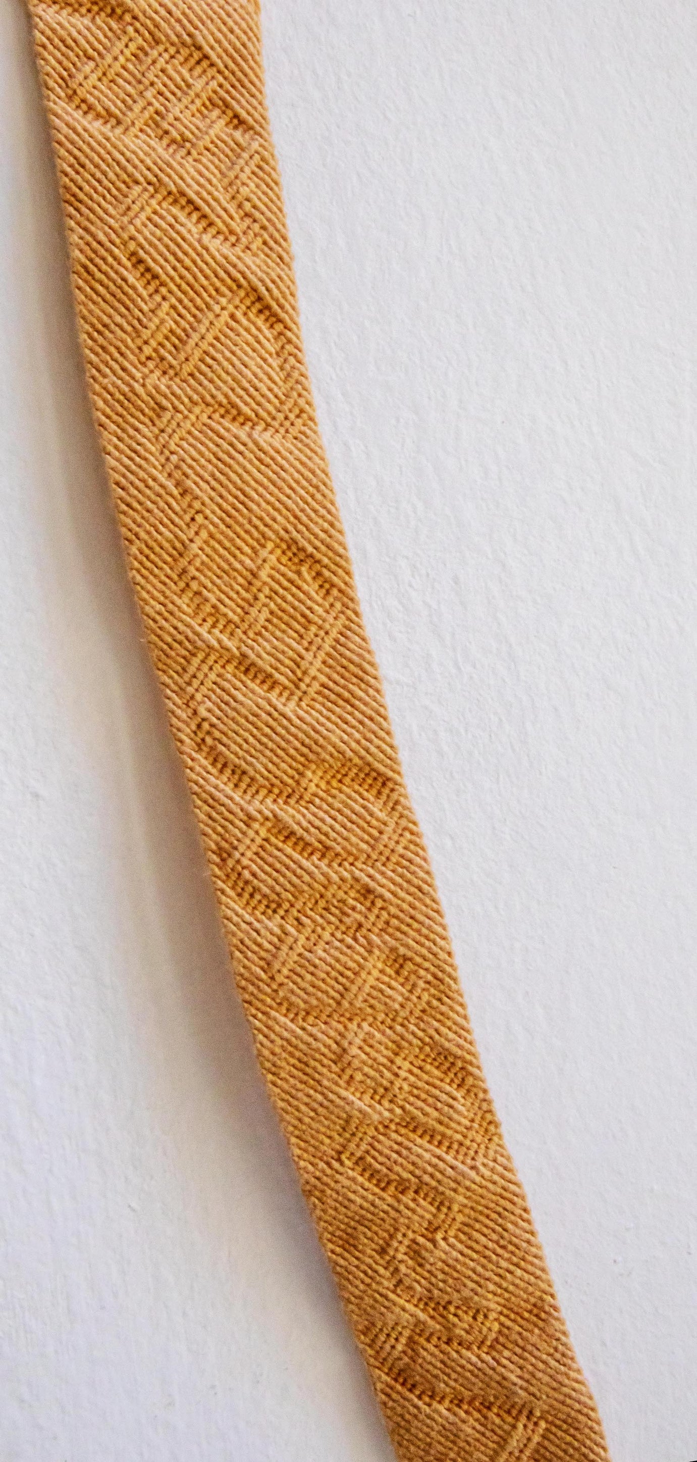
An avid friendship bracelet maker, Sarah thought perhaps she could translate that subtlety to a smaller scale in three dimensions. The result is Knotted Meanders.
“The pattern in this piece is encoded in subtle texture variations, generated by differently-tied knots, rather than the colors [I] used to visualize the data.”
Over a period of four weeks, she drew up a pattern that mimicked a meandering river and tied 6,300 knots to create the textile.
Visitors are also provided context through images of the Amargosa River that Preston captured at a geology field camp in Death Valley, arranged among the graphic panels.
The exhibit is open Friday 3-5p.m., Saturday-Sunday, 12-3p.m. and runs through December 4th.

